Kaiser Permanente Inventory Management System – University of California Irvine Capstone Project
My Role: UX / UI Design Lead
Team: Michael Sawina, Tina Hong, Jennifer Chan, Hayley Williams, Jing Chu
Project Duration: 6 months
Programs Used: Figma, Illustrator, Photoshop, Validately.com
Problem
Kaiser Permanente needed a more efficient inventory management tool to manage hospital equipment across the Southern California region. The existing myMITI website was fragmented and outdated, requiring several steps to complete simple tasks. The process for filling out forms was not put in place, resulting in errors. Employees were not notified when actions were required to be taken on their end. This results in prolonged time for procedures to be completed
Solution
We re-designed the myMITI website and streamlined the website architecture to make it is easier and more intuitive for users to complete their tasks. We added the process of forms to the website with error-prevention in mind. This offers a “push-back feature” that immediately notifies a person upstream of any mistakes that need to be corrected. Employees are now informed through their worklist page that a task needs to be completed.
Project Overview Video
Research & Development Process
Original Kaiser Permanente Website
Research Overview
In the early stages of the project, we needed to develop an understanding of the problem and the current state of the product. Our research goals were to develop a better understanding of the original website, and what actionable changes could be made to benefit the current end users of the product. In this initial sprint, multiple research methodologies were implemented as follows.
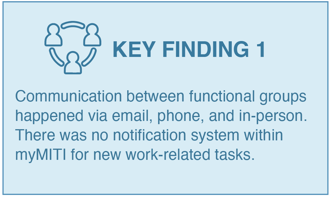
Stakeholder Interview: Key Findings
These are 3 most important insights gathered from stakeholder interviews. These findings were used to develop personas, storyboards, and scenarios.
Personas
Synthesizing our interviews helped us create personas that would allow us to have empathy and gain perspective of our end users. MyMiti’s website is used by a diverse range of departments so it was imperative that we recognized each of our users’ needs, goals, and expectations.
Storyboards & Scenarios
We developed scenarios and storyboards to give our stakeholders a visual representation of what the newly designed myMITI website could look like. It also helped us to understand the flow of user interaction with the product while keeping our end goal in mind.
Information Architecture Analysis
We mapped out the original myMITI website and annotated opportunities for improvement.
Tree Test Key Findings
A sample of Kaiser employees participated in the information architecture analysis study of the original myMITI website. This study aims to verify the expectations of our clients and stakeholders regarding the optimal organization of the website.
Design Overview
With research and analysis as our foundation, we were finally ready to begin the highly iterative design process. We explored many different solutions in a short amount of time. Each idea was unique in addressing how we might meet the needs of all of our users.
Moodboards
Refined Sketches
As a team, we all came up with sketches of what we thought the new myMITI website should look like. We presented these ideas to the client and narrowed down the design direction based on their input.
Initial Wireframes
At the midpoint of the project, we begin to develop wireframes for the core screens. At this stage, we developed 20 wireframes. Below are some of the most important.
Formative Usability Evaluation
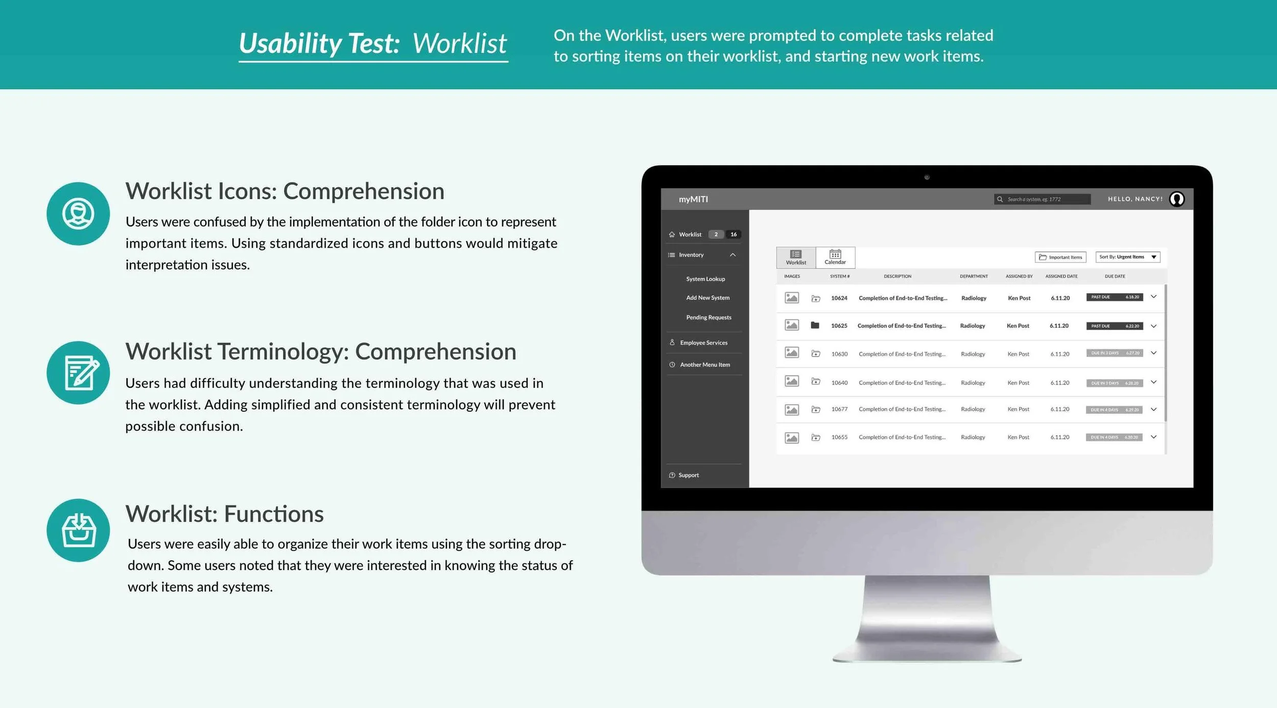
After building a wireframe prototype we conducted a test on validately.com to identify any potential issues with the prototype. A sample of 9 Kaiser employees participated in this remote study. They were given a set of four core tasks – navigating the worklist, looking up system information using a search filter, using pushback mode on a form, and initiating action on the system detail page. Below are the results of those findings from this test.
Summative Usability Evaluation
We implemented a final usability evaluation to evaluate the adjusted designs and implementations. At this stage, the research goals were to evaluate and understand the current state of the prototype on the aspects of perceived usefulness, clarity and general usability. Using a combination of stakeholder feedback, and the results gathered in the formative evaluation and followup survey, a finalized prototype was completed. It was used for the final usability evaluation.
Final Prototype Video Walkthrough
Accessibility Color Contrast Checker
I used a color contrast checker for the 3 primary colors used in the myMITI system to ensure that text and icons are easy to read for all.
myMITI system Style Guide & Design System
Conclusion
Our final prototype with Kaiser resulted in positive feedback. After presenting to the team, we were proud and excited to learn that their developers have started to work on putting our designs into production. Working with the Kaiser team has been a valuable experience. We are thankful for their guidance and mentorship over the past 6 months.


